Skip to content
New issue

Have a question about this project? Sign up for a free GitHub account to open an issue and contact its maintainers and the community.

By clicking “Sign up for GitHub”, you agree to our terms of service and privacy statement. We’ll occasionally send you account related emails.

Already on GitHub? Sign in to your account

Mapping Map Elements #87

Open
rasagy opened this issue Jan 6, 2025 · 15 comments
Open

Mapping Map Elements #87

rasagy opened this issue Jan 6, 2025 · 15 comments

Comments

@rasagy
Copy link
Collaborator

rasagy commented Jan 6, 2025

Hi everyone. Let’s start with our exercise to evaluate elements of a map.

Find an example of a map and make a small map taxonomy chart with examples of key elements, such as:

  • Typography (How do labels of country vs city vs river vs forests differ?)
  • Color (Land vs Water vs specific regions vs admin boundaries vs transportation or PoI)
  • Iconography (Land use, PoI, transportation)
  • Patterns or textures
  • Any other detail that you notice

For each map, write about:

  • link to the map
  • the designer/cartographer
  • the topic/area the map represents
  • the style of map
  • what you loved
  • what could be better

References

@d-puk
Copy link

d-puk commented Jan 6, 2025

Bombshell Reports
A map by James Cheshire and Oliver Uberti from their book Atlas of the Invisible.

Topic : Declassified data on the secret bombing of Cambodia during the Vietnam War.

The map shows bombing targets, year and type of payload. This information helps non-profits locate and defuse unexploded ordnance so that the bombed countries can become 'mine-free'.

map breakdown

What I loved

  • The layered storytelling – Colours and icons combined with flight paths reconstruct the actions of each party involved.
  • Colour selection really highlights the scale of ordnance used
  • Insets and frames also reinforce where the action is taking place and what region the viewer is looking at
  • Icon sizes are grouped in buckets to show the uncertainty in the number of bombs used

What can be improved

  • Typography for annotations and place names can be more visually distinct.
  • Border colours can be more visually distinct

@arushiverma1999
Copy link

arushiverma1999 commented Jan 6, 2025

Selected Map: Plan de la Ville de Pondichery 1856
Creator : Nicolas de Fer
"Plan of the City of Pondicherry. Legend of the Streets of the White Town and Black Town of Pondicherry with the order numbers corresponding to those of the map approved by the Governor in May 1856"
Distinction
White Town: Primarily inhabited by Europeans and higher-class individuals.
Black Town: Inhabited by the native population.
https://storage.googleapis.com/raremaps/img/xlarge/58607.jpg
map2

What I like

Cultural Duality
The map illustrates the coexistence of French and Indian cultures, even if divided into the White Town and Black Town and its easily recognisable in the map.

Fine Detailing
Landmarks like silk farm, silk creation room are included

@Zayyy007
Copy link

Zayyy007 commented Jan 6, 2025

cantinooo01

Pragya Upadhyay
Selected Map - Cantino Planisphere, created in 1502 by an anonymous Portuguese cartographer.https://upload.wikimedia.org/wikipedia/commons/9/9c/Cantino_planisphere_%281502%29.jpg

Why this Map - Cantino Planisphere was commissioned by Alberto Cantino, an Italian agent and spy working for the Duke of Ferrara. Cantino acquired the map to smuggle Portugal’s highly guarded geographical knowledge back to Italy, as Portugal was leading the Age of Exploration at the time. Though the cartographer's identity remains a mystery, the map is a masterpiece of early 16th-century Portuguese cartography, reflecting their significant discoveries and territorial claims.

What I love
1- Age of Exploration Insight: The map provides a snapshot of European understanding of the world in the early 16th century,
reflecting discoveries in the Americas, Africa, and India.
2- State-of-the-Art Mapping (for its time): It uses advanced cartographic techniques of the period, including accurate
coastlines and detailed representations of regions.
3- Symbolism and Design: Analyze artistic elements such as red sea , compass roses, flags, and decorative motifs, which add
layers of meaning.

@SiddhantKNID
Copy link

SiddhantKNID commented Jan 6, 2025

Map of the Islands of Mumbai & Colaba
Og_Mumbai
MapLink:- https://ars.els-cdn.com/content/image/1-s2.0-S0305748816301529-gr7_lrg.jpg

@buzzgod
Copy link

buzzgod commented Jan 6, 2025

Oslo_Kollektivkart_2022_page-0001

Link - https://t2design.no/oslo-transit-diagram-2022

Creator - Torger Jansen

About -Its transit map of oslo that was revised in 2022.

Style- style of the map is like schematic diagrams

Why i liked it ?- I found the 2022 Oslo Metro map to be a significant improvement over the 2017 version. It's much easier to understand, with all lines clearly visible on a single network. The use of the official line colors enhances clarity, and the map effectively compresses distances for better readability. Overall, the 2022 map strikes a better balance between visual appeal and functional utility, making it a more user-friendly experience for navigating the city's public transportation system.

Scope of improvement- There can be many scope for improvements For example, incorporating more visual cues to indicate transfer points could further enhance user experience. Perhaps a slightly larger station circle at transfer hubs, or a subtle visual cue like a small connecting line between platforms, could improve navigation.Additionally, integrating real-time information, such as service disruptions or delays, directly onto the map would provide a more dynamic and informative experience for passengers.]([https://t2design.no/oslo-transit-diagram-2022])

@Anandana0298
Copy link

Anandana0298 commented Jan 6, 2025

Map- Mappa Mundi by Fra Mauro ( 1459)
Interactive version

The Mappa Mundi by Fra Mauro (c. 1450) is known as the earliest detailed representation of the known world. A monk in an Italian Monastery who had not set foot outside the country, ended up crowdsourcing the first close to accurate world map.

Assignment_MappaMundi

@tanishigola
Copy link

Alaska Topographic Map Index, 1927

The USGS (U.S. Geological Survey) was entrusted with the responsibility for mapping the country in 1879 and has been the primary civilian mapping agency of the United States ever since. This map serves as an index for the area covered and the surveys done for the various topographical maps of Alaska that were put on sale by the USGS.

Collection: The University of Texas at Austin - Perry-Castañeda Library
Made by: USGS
https://orthoslogos.fr/cartographie/alaska-topographic-maps/

Mapping map - Alaska topography

@ch0psuey21
Copy link

ch0psuey21 commented Jan 6, 2025

Tourist Map of Sikkim
Sonam Norbu (2022)
https://touristmapofsikkim.com/

for git

@anushaa20
Copy link

Map Link
mappa mundi

@kokoberry21
Copy link

kokoberry21 commented Jan 6, 2025

Komal, InfoD
Ebstorf Mappa Mundi
The Ebstorf Map, created in the 13th century, is a medieval mappa mundi that offers a fascinating glimpse into the medieval European worldview.

A4 - 1Map

A4 - 1Map.pdf

Link: https://en.wikipedia.org/wiki/Ebstorf_Map, https://uploads.knightlab.com/storymapjs/5b68c00bbff367e627d624ee3f32ce79/ebstorf-mappa-mundi/draft.html (interactive storytelling)
Designer/Cartographer: Attributed to Gervase of Ebstorf
Topic/Area Represented: A medieval European depiction of the known world

What I Loved: The detailed and colorful depictions of cities, landmarks, and mythical creatures

@DhvaniJ
Copy link

DhvaniJ commented Jan 6, 2025

Brun Valley Forest Park Map

https://www.pfo.org.uk/maps/brun-valley-forest-park

A4 (1)

The Brun Valley Forest Park map is highly detailed, not only providing extensive specifications for all elements but also breaking down individual elements into multiple subcategories. This level of detail ensures precision but can feel overwhelming for casual users.

@shivamarya10
Copy link

shivamarya10 commented Jan 6, 2025

1
2
3

3.pdf

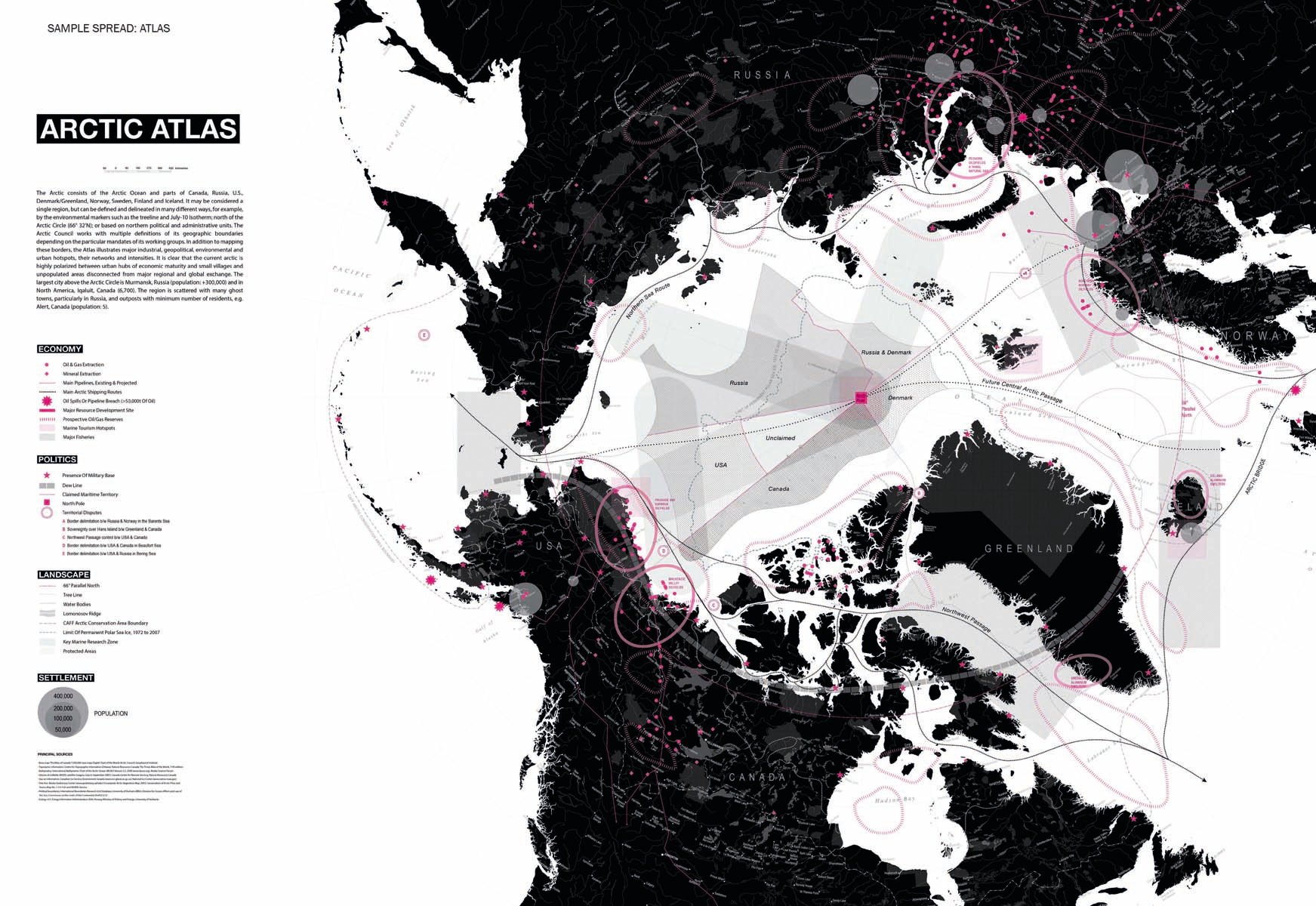
Mediating Environments/ARCTIC DESIGN GROUP

https://www.accartbooks.com/app/uploads/books/9781940743615-28-2.jpg
https://www.accartbooks.com/uk/book/mediating-environments/
https://medium.com/our-arctic-nation/virginia-reaches-north-designing-future-arctic-cities-4f4d42f943b2

What I Loved?

Artistic Appeal: The maps blend aesthetic and informational qualities, making them visually engaging while remaining functional.
Patterns/Textures: Shaded relief and subtle textures add depth to the map, enhancing the sense of terrain and natural features.
Color Palette: Muted tones create harmony and reduce visual clutter, drawing attention to key features.

What Could Be Better?

Detail for Small Features: Some natural or cultural landmarks might be hard to locate due to the artistic abstraction.
Legend Accessibility: Compact legends are great for aesthetics, but they might be less intuitive for quick interpretation.

@Sanket86400
Copy link

Selected Map: The Chicago Community Settlement Map
About: It is a historic and significant cartographic work that depicts the cultural and ethnic composition of Chicago neighborhoods in the early 20th century.
Designer/Creator: Jane Addams
Link: https://photos.com/featured/community-settlement-map-chicago-chicago-history-museum.html
Sanket_Cartography

@Sarbottama
Copy link

Sarbottama commented Jan 6, 2025

Sign up for free to join this conversation on GitHub. Already have an account? Sign in to comment
Projects
None yet
Development

No branches or pull requests