##Auditing media queries using JavaScript
TL;DR: You can use JavaScript to easily audit the media queries that are present in your project. This could potentially provide insight into portions of your styling that might need to be examined more closely. Don't care about the rational behind doing something like this and are just looking for a snippet? Head here.
While the overall thoughtfulness around how frontends are built has improved in recent years, generally speaking, styling simply isn't treated with the same amount of care and consideration as other parts of the front-end stack. Marry this apathy with tools like Sass/LESS/Stylus which enable developers to easily write complex and powerful CSS, and it's easy to envision the sort of tangled, nightmarish abomination that might exist in this world.
In my experience, this usually takes the form of a framework like Bootstrap or Foundation that has had so many layers of paint and ad hoc fixes applied to it that Theseus would be proud.
The likelihood of confronting this sort of monstrosity is never higher than when a developer inherits an existing web project, and on the surface, poorly written styling might not seem like a big issue. Unfortunately, when the time comes to make updates to the project, the flaws and idiosyncrasies that exist in the CSS can quickly become a massive time sink as ad hoc fixes for one problem cascades into other issues. The ideal course of action would be to go through and completely refactor the styling, but due to time constraints and the perceived magnitude of the task, its something that is rarely is attempted.
One solution to this apprenhension is to audit the style sheet's media queries. This sort of analysis is an easy way to see where potential issues and low-hanging fruit might exist. This provides a clear starting place for any refactoring work and helps make a seemingly herculean task into something much more palatable. Best of all, this discovery and documentation process can be automated using JavaScript.
####What are we doing
So what exactly will be happening?
- Pick a target style sheet and get it's cssRuleList
Note: Keep in mind that style sheets are subject to the same-origin policy. This means that if the style sheet's origin doesn't match that of the page (e.g. being loaded from a CDN), the cssRules property of theCSSStyleSheetobject isn't available and returnsnull. Some thoughts on dealing with this issue can be found here. - loop through this collection of CSSRules looking for CSSMediaRules
- When one is found,
- if it hasn't been seen before, map it to
mediaQueriesMapvariable we have setup, - increment the count value for this
CSSMediaRulein the map, - add all
cssRulesfound within this particular instance of the media query to the entry in themediaQueriesMapvariable,
- if it hasn't been seen before, map it to
- Finally we format
mediaQueriesMapinto a table and print it in the console.
var mediaQueriesMap = new Map();

var rules;


//--isolate the style sheet you want to work with.

//set it directly by picking it from the styleSheets array. Here we're using the sheet at index 3.
rules = document.styleSheets[3].cssRules;

//set it by referencing it's url
function getStyleSheetByUrl(url){
    for (var i = document.styleSheets.length - 1; i >= 0; i--) {
        if( document.styleSheets[i].href == url){
            rules = document.styleSheets[i].cssRules;
        }
    }
}
getStyleSheetByUrl('http://www.webste.com/style.css');


//--create the map
Array.prototype.forEach.call(rules, function(rule,i){
    if(rule instanceof CSSMediaRule){
        var mediaQueryRule = rule.media.mediaText;
        if(!mediaQueriesMap.has(mediaQueryRule)){//adds rule to the map if missing
            mediaQueriesMap.set(mediaQueryRule, {styleRules:[], occurrences:0});
        }
        //log the rule's occurance
        mediaQueriesMap.get(mediaQueryRule).occurrences++;
        //add this media queries style rules to the map
        Array.prototype.forEach.call(rule.cssRules, function(styleRule,i){
            mediaQueriesMap.get(mediaQueryRule).styleRules.push(styleRule);
        });
    }
});

//--print results to a console table
var reportingTable = []
for (var entry of mediaQueriesMap){
    reportingTable.push( {
        mediaQuery:entry[0],
        occurrencesInStylesheet:entry[1].occurrences,
        countOfStyleRules:entry[1].styleRules.length
    });
}

console.table(reportingTable);


//optional - print results to a csv formated string that can be saved via a text editor
/*
var csv = '--Media Query--,--times it appears--,--style rules within this media rule--\n';
for (var entry of mediaQueriesMap){
    csv+=entry[0]+', '+entry[1].occurrences+', '+entry[1].styleRules.length+'\n'
}
console.log(csv);
*/
####Analyzing the results
What do we do with this data? The general idea is to look for things that that seem different or stand out. Developers are creatures of habit, so if something seems inconsistent, peculiar, or out-of-place, it's likely that it was written by a different developer, or under different circumstances. These are the places we want to initially focus on, as they are more likely yield potential refactoring opportunities. At the very least they can be brought into alignment with the rest of the codebase to help make everything more maintainable going forward.
Specifically, we're on the looking for things like:
- inconsistent or mistyped values
- weird edge cases & one-offs that could potentially need investigating.
- potential definition overlaps and places to check for unintentional "double styling"
Let's look at an example.
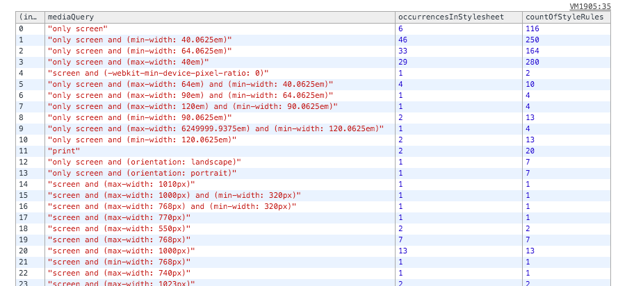
I've run the audit script on a project that I recently inherited, and the image below is what was outputed to the console.
At the top of table, we see several media queries that contain the majority of the rules for this project. We know that this project was built uing Foundation 5, so seeing their media feature definitions using the em length units is to be expected. These media queries are most likely using Foundation's built in variables or are defined using a value that is consistent with those variables.
Around #14 ("screen and (max-width: 1010px)) we see the media queries begin to be defined using the absolute length unit of px. While arguments can be made for using either length unit (px or em) in media query definitions, the bigger issue in this particular instance is of consistency. With the vast majority of the styling rules being housed in em based media queries, these px based definitions stand out, and should be examined more closely for code smell, adherence/disregard for best practices, and broken code. At the very least, they should be rewritten to use the established methodology of the rest of the project.
The next point of interest involves #17 ( "screen and (max-width: 770px)" ).
Beyond the previously mentioned length unit inconsistencies, their doesn't seem to be anything inherently wrong with this particular media query at first glance. The issue starts to become more apparent when it is compared against some of the other media queries. #16 ( "screen and (max-width: 768px) and (min-width: 320px)" ) and #19 ( "screen and (max-width: 768px)" ) are using incredibly similar (but not quite matching) values in their definitions.
The odds of a specific rule needing to be exactly 2px smaller than an established breakpoint isn't very high.
The more likely explanation is that the author either forgot or wasn't aware of the exact breakpoint that is used elsewhere in the project. Either way, this portion of the code is probably something that should be flagged for a closer look.
Finally, #20 ( "screen and (min-width: 768px)" ) appears to be overlapping with some media queries that are set to use "max-width: 768px" ( #16 & #19).
It's no accident that CSS frameworks define their breakpoints in a consistent manor that prevents overlap (e.g. Bootstrap & Foundation), so when there are multiple definitions checking a particular media feature for an identical value but with opposing prefixes, it is something that should be investigated. Perhaps it's just a simple inconsistency in how a particular breakpoint was authored, but there is also a possibility of a huge issue where multiple elements are getting conflicting styling instructions when the width is 768px.
The mediaQueriesMap map that is created is fairly flexible. In addition to creating a general overview, it can be used to drill into specific media queries.
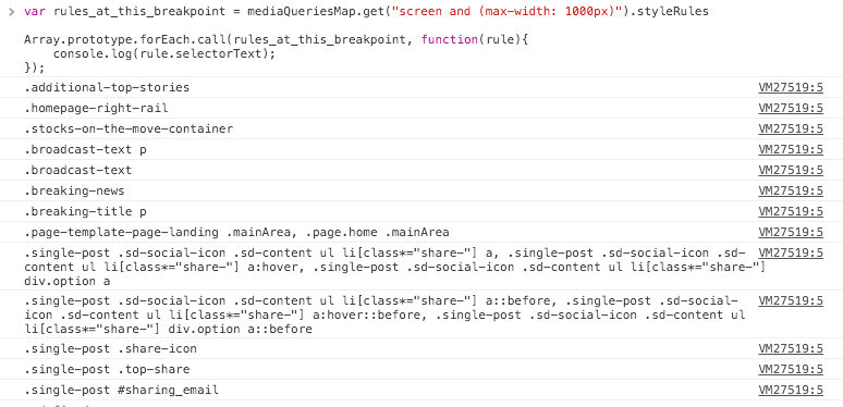
In the prior example we can see that the media query screen and (max-width: 1000px) is being used in the style sheet 13 different times to declare 13 different rules. Using our existing mediaQueriesMap variable we can see what selectors are being used for each of those rules.
var rules_at_this_breakpoint = mediaQueriesMap.get("screen and (max-width: 1000px)").styleRules


Array.prototype.forEach.call(rules_at_this_breakpoint, function(rule){
    console.log(rule.selectorText);
});
The resulting output (below) could be useful in tracking down where exactly within the a project's uncompiled Sass/LESS/Stylus files to start looking for an issue.

