This application is written using ReactJS and compiled using WebpackJS
- Getting Started
- WebPack configuration
- Apps Without Redux
- Compiling Your Code
- NPM Commands
- Functional Components
- Styled Components
- Utils
- Themes
- Useful Resources
You will be required to install the latest version of NodeJS as the project will rely heavily on NPM (Node Package Manager). Once installed check to see if NPM installed correctly by opening up a terminal or command prompt and trying > npm --version
If you already have nodejs on your machine but are unsure if you have the latest version of npm then run the command > npm install -g npm@latest
In order to compile and deploy your React project you will need to download some node modules. Open a terminal, navigate to you project directory and run > npm install. This will download files like react, webpack, babel compilers, etc.
There are some files that you will need to update before so start compiling your code with webpack.
- spFolder
- This is the path where you would like to upload files on SharePoint. (Ex. SiteAssets/Scripts/Test)
- username/password
{
    "username": "",
    "password": ""
}
or
- clientId/clientSecret
{
    "clientId": "",
    "clientSecret": ""
}
-
siteUrl
- This is the site SharePoint site url. (Ex. https://tenant.sharepoint.com/sites/Test)
-
projectFiles
- These are the files that will be uploaded to your SharePoint site.
- publicPath
- Update this variable with the relative path to your project file located on SharePoint. This should be the same folder destination as
spFolderlocated in sp-deploy.js (Ex. ../SiteAssets/Scripts/Test/)
- Update this variable with the relative path to your project file located on SharePoint. This should be the same folder destination as
- script links
- Both script links will need to link to your project files. Only bundle.js and config.js are required to get your application to load.
Remove ./client/index.js and rename ./client/index-no-redux.js to ./client/index.js.
During development you will need to run the command > npm run dev. This command will start Webpack, which will watch and compile your code into bundle files. As you write code if the file watcher notices that a file has changed it will kick off the compiler keeping you bundle files up to date.
Keep this terminal/command prompt open while developing your code or the compiler will stop running.
Do not be alarmed by the file sizes. This file is for development only and will be a lot smaller when you do a production build.
It is a good idea to test the production build before deploying your application. Run the command > npm run build to build your application with production settings and deploy to your dev environment before deploying to production.
Running the command > npm run deploy will build your application with production settings and deploy it to the environment specified in sp-config.prod.js.
If you have unit tests you may run them with this command manually

> npm run test
Used while developing your application

> npm run dev
Used to test the production build of your application

> npm run build
Used when you are ready to go into production

> npm run deploy
Listed below are all the functional components available in this boilerplate. Each component should have a short description of what it does, all the props available for this component, and an example of how to use it.
The people picker component is an text input field that sends a REST call to SharePoint querying people in the company. The people picker can be either a single user input or multiple user input. You can also allow for the creation or a user if none are found.
| Prop Name | Type | Default | Description |
|---|---|---|---|
| onChange | Function | - | When there is a new user selected the on change event will return all users in an array |
| multi | Boolean | false | Allows for multiple users to be selected |
| value | Array | [] | An array of user objects |
| placeholder | String | 'Please select a user' | Placeholder value when no users have been selected |
| disabled | Boolean | false | Locks the input from any further interaction |
| creatable | Boolean | false | Allows you to create people that are not found |
| excludedUsers | Array | [] | Array of emails you would like to exclude from search |
import PeoplePicker from '../common/people-picker';

export default class MyComponent extends React.Component {
    constructor(props) {
        super(props);
        this.state = {
            people: []
        }
    }

    handleOnChange(value) {
        this.setState({
            people: value
        });
    }

    render() {
        return (
            <div>
                <PeoplePicker
                    onChange={this.handleOnChange.bind(this)}
                    disabled={false}
                    placeholder="Please select multiple users"
                    multi={true}
                    value={this.state.people}
                />
            </div>
        )
    }
}
This ImageUpload component is a simple drop target that allows for images under a set file size limit. When an image is dropped or selected from the drop target then the component will return the whole image blob to the parent. Supplying an image property will allow the user to see a preview of the image that they have selected.
| Prop Name | Type | Default | Description |
|---|---|---|---|
| onImageChange | Function | - | When an image under 800kb is drop/selected the event with the new image will be returned |
| image | URL | - | This is the url/data uri of an image. Usually its the image being uploaded but you can send anything. |
| fileSizeLimit | Number | 800000 | File size limit is represented in bytes |
import ImageUpload from '../common/image-upload';

export default class MyComponent extends React.Component {
    constructor(props) {
        super(props);
        this.state = {
            image: null
        }
    }

    /**
     * Store the image data when a new file is drop or selected
     * @param event
     */
    onImageChange(event) {
        let self = this;
        let eventTarget = event.target;
        if (event.target.files && event.target.files[0]) {
            let reader = new FileReader();
                reader.onloadend = function(e) {
                    self.setState({
                        image: e.target.result
                    });
                };
                reader.readAsDataURL(eventTarget.files[0]);
        }
    }

    render() {
        return (
            <div>
                <ImageUpload
                    onImageChange={this.onImageChange.bind(this)}
                    image={this.state.image}
                    fileSizeLimit={500000}
                />
            </div>
        )
    }
}Generates an iframe with a specific url.
| Prop Name | Type | Default | Description |
|---|---|---|---|
| url | Url | '../Shared Documents/Forms/AllItems.aspx' | The iframe location |
import Iframe from '../common/iframe';

export default class MyComponent extends React.Component {
    constructor(props) {
        super(props);
    }

    render() {
        return (
            <div>
                <Iframe
                    url="https://tenant.sharepoint.com/sites/SomeSite"
                />
            </div>
        )
    }
}Generates a collapsible container with header.
Install using

> npm install react-collapsible
| Prop Name | Type | Default | Description |
|---|---|---|---|
| trigger | String | "" | Label for the container header |
| open | Boolean | true | Condition for being open |
Full list of props at React-Collapsible.
import Collapsible from 'react-collapsible';

export default class MyComponent extends React.Component {
    constructor(props) {
        super(props);
    }

    render() {
        const isOpen = true;

        return (
            <div>
                <Collapsible trigger="My Header" open={isOpen}>
                    My Content
                </Collapsible>
            </div>
        )
    }
}Creates a label with an error message when either a pattern is not matched or the reference field is required but empty.
| Prop Name | Type | Default | Description |
|---|---|---|---|
| label | String | "" | Text for the label |
| message | String | "" | Text for pattern error message |
| requiredLabel | String | "*" | Text for required error message |
| pattern | RegExp | /./ | Regular expression to match |
| required | Boolean | false | Is the field required |
| value | * | "" | Value to check |
import FormLabel from '../common/form-label';

export default class MyComponent extends React.Component {
    constructor(props) {
        super(props);

        this.state = {
            Title: "Hello"
        }
    }

    render() {
        return (
            <div>
                <FormLabel
                    label="Title"
                    value={this.state.Title}
                    required={true}
                    pattern={/^([a-z0-9]){1,7}(,[a-z0-9]{1,7})*$/}
                    message="Must less than 8 characters and comma separated (no spaces)"
                />
                <input type="text" value={this.state.Title}/>
            </div>
        )
    }
}
Creates a modal that sits on top of your page. 'ModalContainer' must be mounted before calling 'modal.show' otherwise nothing will happen.
ModalContainer
| Prop Name | Type | Default | Description |
|---|---|---|---|
| closeLabel | String | '×' | Close button label |
modal
| Method | Params | Example |
|---|---|---|
| show | content, options | modal.show( My Modal ) |
| close | - | modal.close() |
| closeLabel | - | modal.show( My Modal , { closeLable: 'close' } ) |
| hideClose | - | modal.show( My Modal , { hideClose: true } ) |
import React from 'react';
import { ModalContainer, modal } from '../../common/modal';

const MyModal = () => {
    <div>
        <h1>This is a modal</h1>
        <p>This is the content of the modal</p>
        <button type="button" onClick={() => {modal.close()} }>Close Modal </button> // Custom close action
    </div>
}

export default class ModalView extends React.Component {
    constructor(props) {
        super(props);
    }

    showModal() {
        modal.show(
            <MyModal/>, { hideClose: true }
        )
    }

    render() {
        return (
            <div>
                <button type="button" onClick={this.showModal.bind(this)}>Show Modal</button>

                <ModalContainer/> // Must be mounted before using modal.show
            </div>
        )
    }
}
Creates a textarea where comments can be added and a section where previous comments are displayed.
| Prop Name | Type | Default | Description |
|---|---|---|---|
| comments | Array | [] | Array of comments |
| commentLabel | String | 'Comments' | Comment section label |
| onAddComment | Function | - | Returns the markup for a new comment |
| disabled | Boolean | false | Is the add comment button disabled |
| newCommentsVisible | Function | true | Should the new comments section be visible |
import Comments from '../common/comments';

export default class MyComponent extends React.Component {
    constructor(props) {
        super(props);
        this.state = {
            comments: []
        }
    }

    onCommentAdd(obj) {
        let comments = this.state.comments;
            comments.push(obj);

        this.setState({
            comments: comments
        });
    }

    render() {
        return (
            <div>
                <Comments
                    comments={this.state.comments}
                    onCommentAdd={this.onCommentAdd.bind(this)}
                />
            </div>
        )
    }
}
Creates a input field where users can search for attachments and an attachments container for viewing attachments
| Prop Name | Type | Default | Description |
|---|---|---|---|
| itemId | Number | null | Item id for attached files |
| listName | String | null | List name where item exists |
| multiple | Boolean | false | Allow multiple uploads at once |
| disableUpload | Boolean | false | Should the input field be disabled |
| disableRemove | Boolean | false | Should the remove button be disabled |
| uploadVisible | Boolean | true | Should the upload container be visible |
| attachmentsVisible | Boolean | true | Should the attachments be visible |
| limit | Number | null | Max number of attachments |
| notice | String | 'Form must be saved before file attachments can be added.' | Notice when itemId and listName are not present |
| attachmentsLabel | String | 'Attachments' | Label to display above attachments |
| uploadLabel | String | 'File Upload' | Label to display above upload container |
| accept | Array | [] | Array or string containing accepted file types |
import React from 'react';
import Comments from '../common/attachments';

export default class AttachmentsView extends React.Component {
    constructor(props) {
        super(props);
    }

    render() {
        return (
            <div>
                <Attachments
                    itemId={1}
                    listName="ExampleList"
                    multiple={true}
                    limit={5}
                    accept={['application/pdf']}
                    disableUpload={false}
                    disableRemove={false}
                    uploadVisible={true}
                    attachmentsVisible={true}
                />
            </div>
        )
    }
}
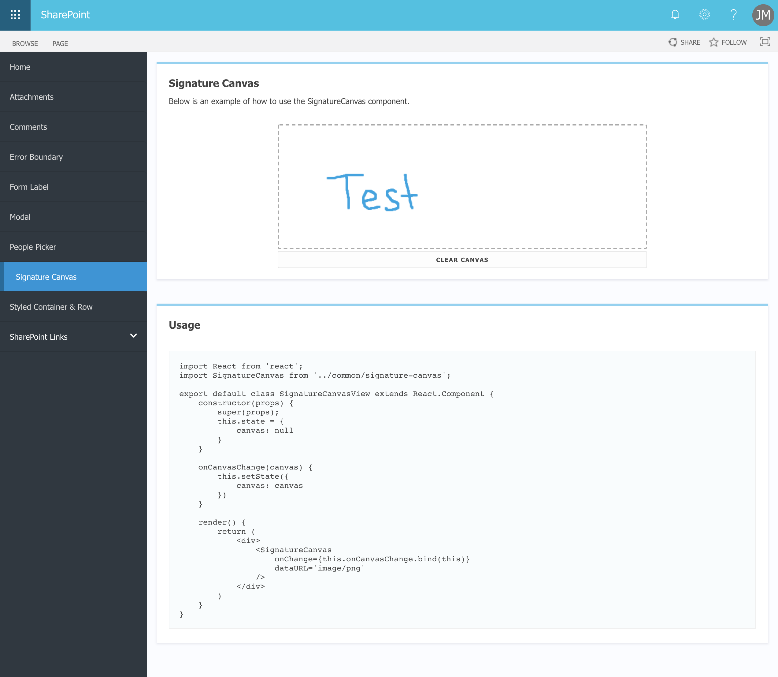
Displays a canvas element where people can put in the signature
| Prop Name | Type | Default | Description |
|---|---|---|---|
| id | String | 'canvas' | The id for your canvas |
| width | Number | 600 | Width of your canvas (ex, {600}) |
| height | Number | 200 | Width of your canvas (ex, {200}) |
| onChange | Function | - | Returns the canvas reference object |
| src | String | "" | Preload an image to the canvas |
| disabled | Boolean | false | disable editing the canvas |
import React from 'react';
import SignatureCanvas from '../common/signature-canvas';

export default class SignatureCanvasView extends React.Component {
    constructor(props) {
        super(props);
        this.state = {
            canvas: null
        }
    }

    onCanvasChange(canvas) {
        this.setState({
            canvas: canvas
        })
    }

    render() {
        return (
            <div>
                <SignatureCanvas
                    onChange={this.onCanvasChange.bind(this)}
                />
            </div>
        )
    }
}
Catches errors that thrown within children components
none
import React from 'react';
import ErrorBoundary from '../common/error-boundary';

export default class ErrorBoundaryView extends React.Component {
    constructor(props) {
        super(props);
    }

    render() {
        return (
            <div>
                <ErrorBoundary>
                    <SomeOtherComponent/>
                </ErrorBoundary>
            </div>
        )
    }
}
Listed below are all the styled components available in this boilerplate. Each component should have a short description of what it does, all the props available for this component, and an example of how to use it.
Styled Container is often used in conjunction with Styled Row, however this is not necessary.
| Prop Name | Type | Default | Description |
|---|---|---|---|
| title | String | - | A title that will show at the top of your container |
| description | String | - | A description that will show just under your title |
| className | String | - | A custom classname so that you can attach your own styles |
import StyledContainer from '../common/styled-container';

export default class MyComponent extends React.Component {
    constructor(props) {
        super(props);
    }

    render() {
        return (
            <div>
                <StyledContainer>
                    <p>This is a child of StyledContainer</p>
                </StyledContainer>
            </div>
        )
    }
}
Styled row uses flex to align all element inside along a horizontal row. A more detailed explanation of how to use the grid system can be found at FlexboxGrid. (Note: This is not a responsive grid system so all columns remove screen size. col-xs-2 now becomes col-2)
| Prop Name | Type | Default | Description |
|---|---|---|---|
| rowType | String | - | The type of row you want. 'reverse', 'start', 'center', 'end', 'top', 'middle', 'bottom', 'around', 'between' |
import StyledContainer from '../common/styled-container';
import StyledRow from '../common/styled-row';

export default class MyComponent extends React.Component {
    constructor(props) {
        super(props);
    }

    render() {
        return (
            <div>
                <StyledContainer>
                    {/* Even spaced columns */}
                    <StyledRow>
                        <div className="col">
                             <span>Column 1</span>
                        </div>

                        <div className="col">
                             <span>Column 2</span>
                        </div>
                    </StyledRow>

                    {/* Reverse columns */}
                    <StyledRow rowType="reverse">
                        <div className="col">
                             <input type="text"/>
                        </div>

                        <div className="col-2">
                             <button>Save</button>
                        </div>
                    </StyledRow>
                </StyledContainer>
            </div>
        )
    }
}
The loading animation simply displays a styled CSS loading animation. This component requires no props and is used just for styling.
none
import LoadingAnimation from '../common/loading-animation';

export default class MyComponent extends React.Component {
    constructor(props) {
        super(props);
        this.state = {
            isReady: false
        }
    }

    render() {
        return (
            <div>
                {this.state.isReady && (
                    <span>My Application</span>
                )}

                {!this.state.isReady && (
                    <LoadingAnimation/>
                )}
            </div>
        )
    }
}Listed below are all the utils available in this boilerplate. Each util should have a short description of what it does, how to interact with it, and an example of how to use it.
Scroll to top is a function that can be called to smooth scroll the window to the very top of the page.
none
import * as Utils from '../../lib/utils';

export default class MyComponent extends React.Component {
    constructor(props) {
        super(props);
    }

    render() {
        return (
            <div>
                <button type="button" onClick={Utils.scrollToTop}>Back to top</button>
            </div>
        )
    }
}Listed below are all the themes available in this boilerplate. Each theme should have a short description of what it does and an example of how to use it.
Assimilate is a basic theme to style form elements and alter the background color of your SharePoint page to be a soft gray color.
import '../common/styles/assimilate-theme.scss';

export default class MyComponent extends React.Component {
    constructor(props) {
        super(props);
    }

    render() {
        return (
            <div className="application assimilate-theme">
                This is my application
            </div>
        )
    }
}