A customizable paywall component for React Native applications, supporting multiple paywalls and dynamic product selection.
Install the package using npm or yarn:
npm install react-native-paywall
# or
yarn add react-native-paywall
Additionally, the package depends on react-native-safe-area-context for handling safe area insets:
npm install react-native-safe-area-context
# or
yarn add react-native-safe-area-context
You will need to link this dependency if you haven't already done so.
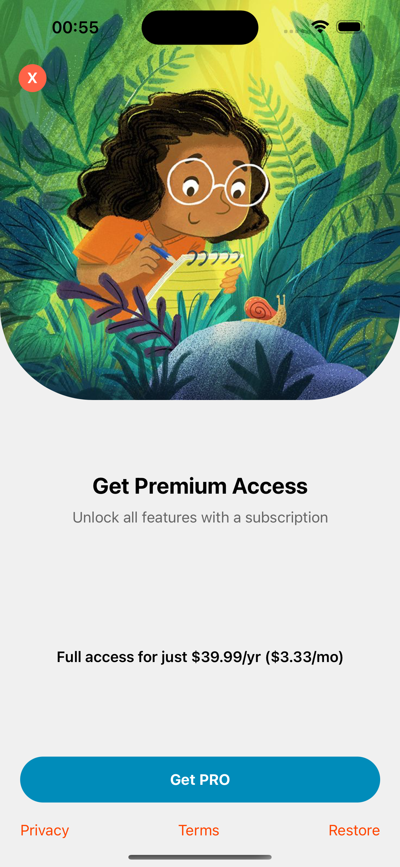
The Istanbul paywall showcases a sleek design optimized for clear pricing and user engagement.
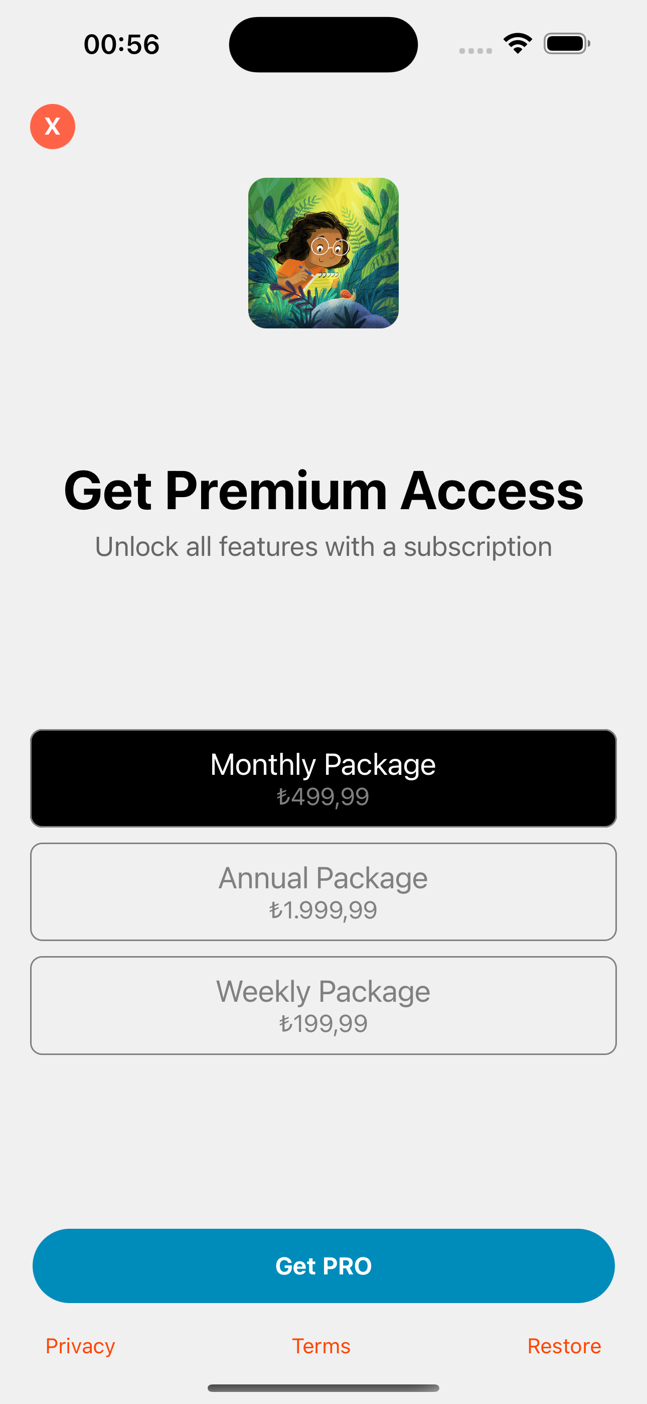
The London paywall focuses on subscription options with visually distinct plans for better user understanding.
Import the usePaywall hook and Paywall component into your project and use them to display paywall screens in your React Native application.
import React from 'react';
import { View, Button, Image } from 'react-native';
import { usePaywall } from 'react-native-paywall';

const App = () => {
  const { showPaywall, hidePaywall, PaywallComponent } = usePaywall();

  return (
    <View style={{ flex: 1, justifyContent: 'center', alignItems: 'center' }}>
      {/* Button to trigger paywall */}
      <Button title="Show Paywall" onPress={() => showPaywall('istanbul')} />

      {/* Render the paywall component */}
      <PaywallComponent
        onContinue={(selectedIndex) => {
          console.log(`User continued with plan index: ${selectedIndex}`);
          hidePaywall();
        }}
        headerText="Ignite your child's curiosity"
        descriptionText="Get access to all our educational content trusted by thousands of parents"
        buttonText="Subscribe Now"
        products={[
          {
            identifier: '$rc_monthly',
            product: {
              title: 'Monthly Plan',
              priceString: '$4.99',
            },
          },
          {
            identifier: '$rc_annual',
            product: {
              title: 'Annual Plan',
              priceString: '$39.99',
            },
          },
        ]}
        imageComponent={
          <Image
            source={{
              uri: 'https://example.com/image.jpg',
            }}
          />
        }
        textButtons={[
          {
            title: 'Privacy',
            onPress: () => console.log('Privacy button pressed'),
          },
          {
            title: 'Terms',
            onPress: () => console.log('Terms button pressed'),
          },
          {
            title: 'Restore',
            onPress: () => console.log('Restore button pressed'),
          },
        ]}
        backgroundColor="#f0f0f0"
        closeButtonBgColor="#FF6347"
        closeButtonTextColor="#FFFFFF"
        closeButtonDelay={3000}
        displayCloseButton={true}
        buttonBgColor="#008CBA"
        buttonTextColor="#FFFFFF"
        buttonRadius={0}
        buttonWidthPercentage={90}
        textButtonColor="#FF4500"
        textButtonUnderline={false}
      />
    </View>
  );
};

export default App;The Paywall component accepts the following props:
-
visible:boolean
Controls whether the paywall is visible. -
onContinue:(selectedIndex: number) => void
Callback function that triggers when the user presses the "Continue" button. Receives the index of the selected product. -
onClose:() => void
Callback function that triggers when the user presses the "Close" button. -
headerText:string
Text to display as the paywall header. -
descriptionText:string
Text to display as the paywall description. -
buttonText:string
Text for the continue button (e.g., "Subscribe Now"). -
products:{ identifier: string; product: { title: string; priceString: string } }[]
Array of product plans to display, each with a unique identifier and pricing information. Allows for dynamic selection between multiple plans. -
imageComponent:React.ReactElement
A custom image component to display on the paywall. -
textButtons:{ title: string; onPress: () => void; }[]
Array of buttons to display at the bottom of the paywall. -
backgroundColor:string
Background color of the paywall. -
closeButtonBgColor:string
Background color of the close button. -
closeButtonTextColor:string
Text color of the close button. -
closeButtonDelay:number
Delay in milliseconds before the close button is displayed. -
displayCloseButton:boolean
Controls whether the close button is displayed. -
buttonBgColor:string
Background color of the continue button. -
buttonTextColor:string
Text color of the continue button. -
buttonRadius:number
Corner radius of the continue button. -
buttonWidthPercentage:number
Width of the continue button as a percentage of the screen width. -
textButtonColor:string
Color of the link text buttons. -
textButtonUnderline:boolean
Controls whether the link text buttons are underlined.
To manage multiple paywalls, you can differentiate each paywall by passing a unique type value (e.g., istanbul or london). In the PaywallComponent, use the type to specify which paywall to show.
import React from 'react';
import { usePaywall } from 'react-native-paywall';

const App = () => {
  const { showPaywall, hidePaywall, PaywallComponent } = usePaywall();

  return (
    <>
      {/* Button to show Istanbul paywall */}
      <Button
        title="Show Istanbul Paywall"
        onPress={() => showPaywall('istanbul')}
      />

      {/* Button to show London paywall */}
      <Button
        title="Show London Paywall"
        onPress={() => showPaywall('london')}
      />

      {/* Istanbul Paywall Component */}
      <PaywallComponent
        type="istanbul"
        headerText="Unlock Istanbul Premium"
        descriptionText="Get access to exclusive content in Istanbul!"
        products={istanbulProducts}
        onContinue={(selectedIndex) => {
          handlePurchase(selectedIndex);
          hidePaywall();
        }}
      />

      {/* London Paywall Component */}
      <PaywallComponent
        type="london"
        headerText="Unlock London Premium"
        descriptionText="Access London premium content and features!"
        products={londonProducts}
        onContinue={(selectedIndex) => {
          handlePurchase(selectedIndex);
          hidePaywall();
        }}
      />
    </>
  );
};The Paywall component comes with a basic design, but you can easily customize it by editing the component’s styles or wrapping it in custom components. You can also pass styling props to customize the look and feel of the paywall without editing the component directly.
MIT License. See LICENSE for more details.

