This demo will showcase some of the options you, as the developer, have when using React-WinJS, JavaScript, and CSS. When you resize your window, or view on different device sizes, the app will adjust its layout to best utilize the available screen real estate.
Here are some examples of the different changes you will see:
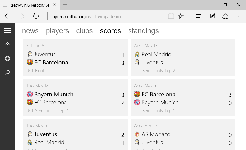
On larger screens, the SplitView pane will push the content to the side, allowing you to freely interact with the content.
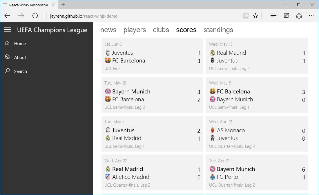
As the screen width decreases, the cells will fluidly re-layout and the AutoSuggestBox will stick to the right side of the screen. Eventually, with the pane opened, the AutoSuggestBox will run out of room, prompting the control to disappear from the top right corner and reappear in the SplitView pane as an additional command.
Decreasing further, the pane will no longer push the content on invocation. Instead, the pane will overlay the content. When the pane is open, you will not be able to interact with the content right away. Clicking outside the pane will lightly dismiss the pane first, then allow normal interaction with the content area.
Similar to when the pane is opened, the AutoSuggestBox will disappear from the top right corner when it runs out of room. It will reappear in the SplitView pane.
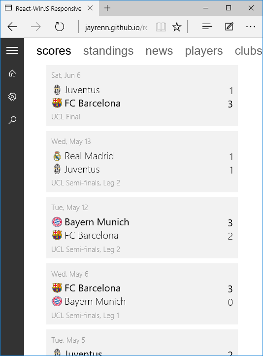
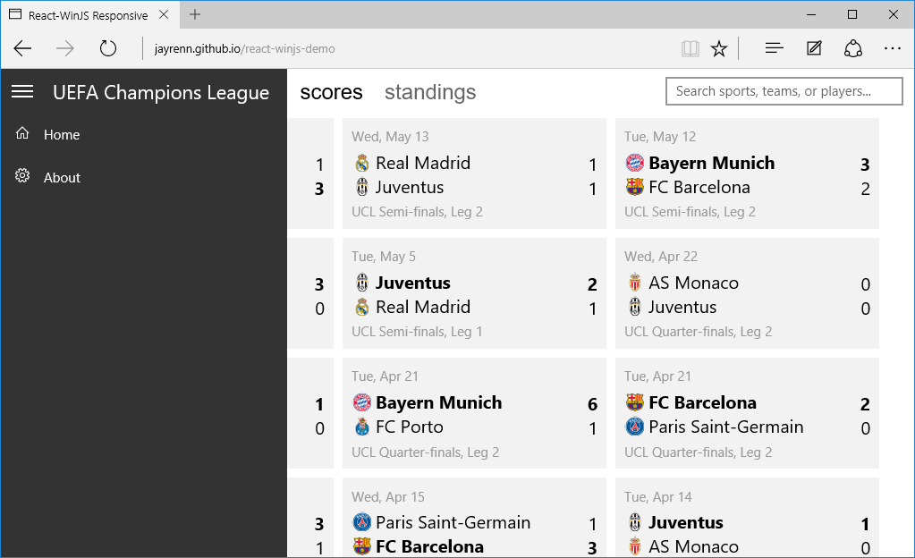
When the Pivot headers become clipped, they will reorder themselves such that the current Pivot section is displayed first. Navigating to another section will either slide the headers to the left or the right, always keeping the current section displayed first. You may recognize this behavior from Windows Phone. Try swiping if you have a touch device!
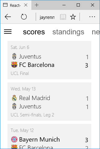
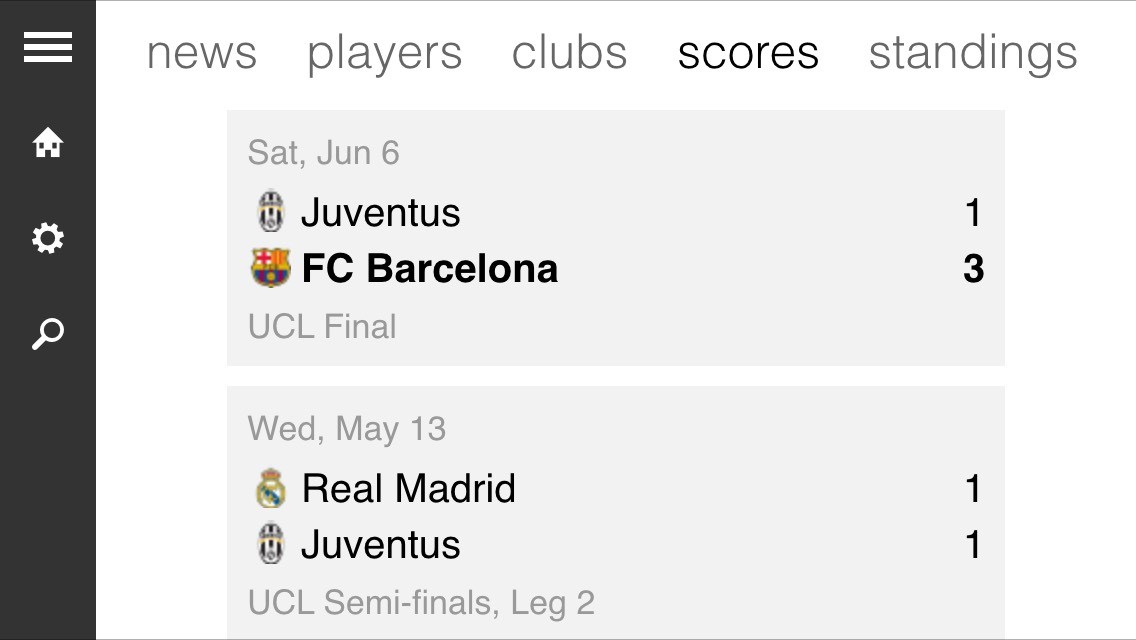
Finally, on the smallest devices, the SplitView pane will hide itself, leaving just the SplitViewPaneToggle control. Clicking the toggle will open and close the pane, with the former action overlaying the content.
Here are some examples of what the app looks like on an iPhone 5s:
Portrait:

Landscape: