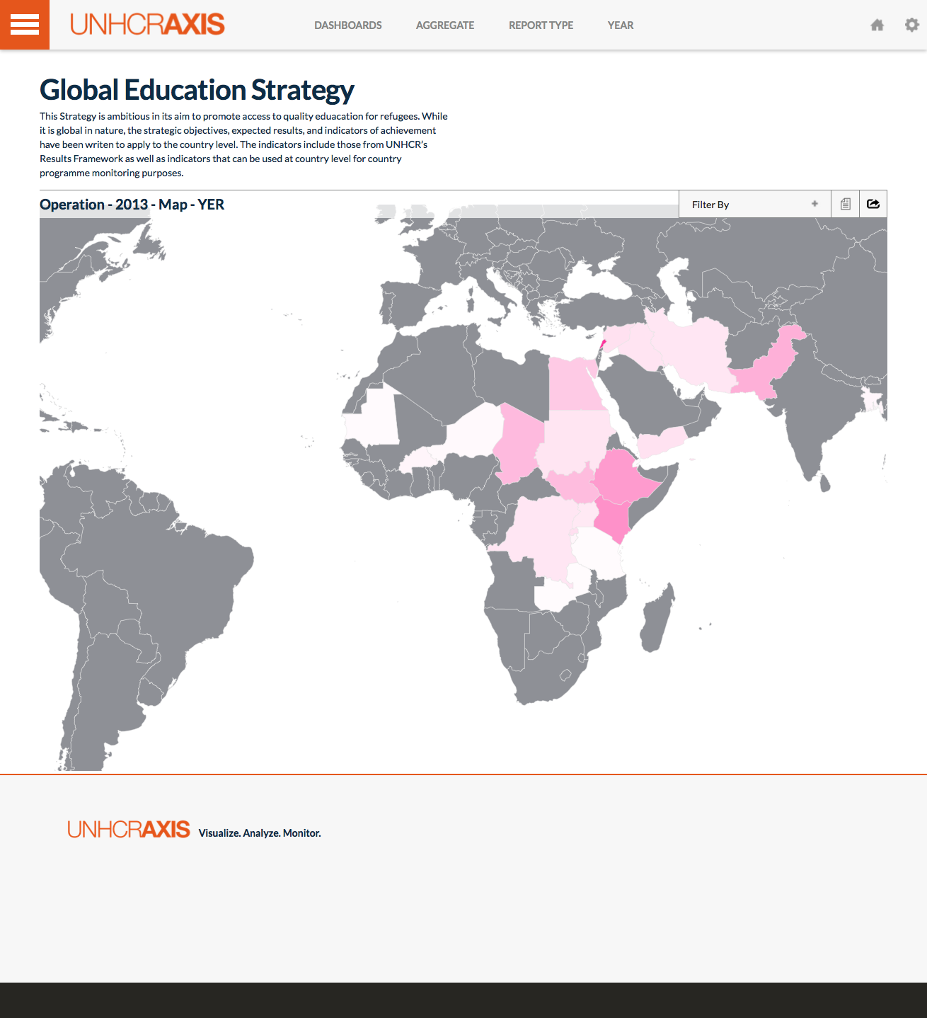
The map dashboard allows you to view budget, expenditures, populations and indicator performance on map. The filter dropdown provides the user with the option to select whether budget, expenditure or indicator is shown on the map. Hover over any of the countries to view the actual value, such as the exact budget number. The gray countries are those that are not included in the strategy. The whiter the country is the closer to 0 it is, while the more pink the country is the higher the value it is.
Note: Aggregation type does not affect this dashboard.
- Above Operating Level - This toggles on or off the Above Operating portion of the budget, when the algorithm is Expenditure or Budget.
- Operating Level - This toggles on or off the Operating portion of the budget, when the algorithm is Expenditure or Budget.
- Budget - This will display a heat map based on budgets of the different operations. The most pink country will have the highest budget.
- Expenditure Rate - This will display a heat map based on expenditures of the different operations. The most pink country will have the highest expenditure rate.
- Impact Criticality - This will display a heat map based on the different impact criticalities. The operation will be either green, yellow or red for Acceptable, Not Acceptable and Critical (respectively).
- Performance Achievement - This will display a heat map based on the different performance indicator achievements. The operation will be closer to pink if it's value is closer to 1.
- Impact Achievement - This will display a heat map based on the different impact indicator achievements. The operation will be closer to pink if it's value is closer to 1.
- Populations - This will display a heat map based on populations of the different operations. The most pink country will have the highest populations of concern.