Point by Point Narratives
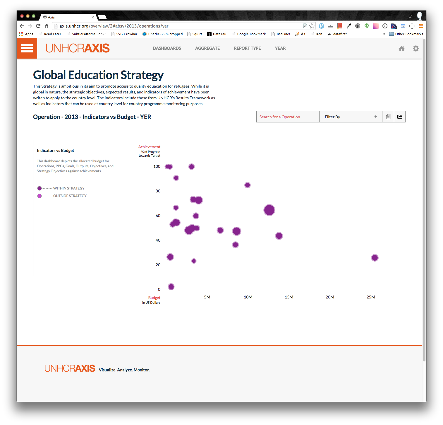
Narratives are text that have been inputed by the field operations to explain why the data is the way it is, and to also give some background context on the operation. Axis understands the need to have written explanation, so we've included a module that easily lets you read the narratives on any of the dashboards you see. For this, let's go back to our trusty Indicators vs Budget dashboard.
Every dashboard that has the ability to show narratives will have this icon:
![]()
You'll notice that the icon is grayed out. In order to view a narrative, Axis has to know which narrative to display. To do this, click on a circle. You'll notice now that that circle is always orange and the narrative icon will darken:
![]()
We call this selecting an "active" datum. Once there's an active datum, you can view the narrative on it. It's easy to switch which datum is active; all you need to do is click a different circle. This is similar to all the other dashboards. Simply click on a point and the narrative icon will activate.
Once the narrative button becomes available, go ahead an click it. You should see a panel from the right extend out. You should get something like this:
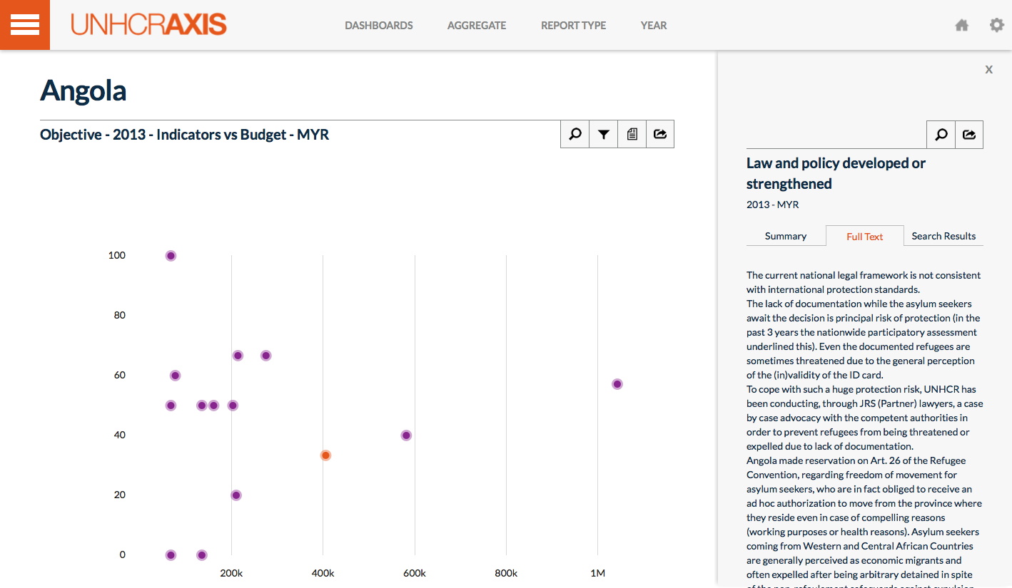
The narrative panel is composed of 3 tabs. The first is the summary tab. This tab displays an automatically generated summary based on the importance of sentences. Do not expect this summary to be well written as it is only a combination of sentences from the actual narrative. It's useful for getting a quick overview. You can dive in further by clicking the "Full Text" tab. This will give you the entire narrative related to the datum you selected. Lastly, there's the Search Results tab. As you might've guessed, this is for searching the full text. You can search by typing into the search box.
Play around with reading some of the narratives. The summary may take a bit to generate. If the narrative panel is open, you can simply select a different data point and the panel will automatically update to reflect the current selection. The panel will also stay present even when you change dashboards. This way if you're reading something interesting, you can keep the panel open and dive into more data. In addition, the panel is exportable to a word document for easier reading. Just click the export button:
Good. Now you've gotten the hang of the narrative panel. Try using it on different dashboards and see what you get. Remember that the narratives change based on the year and report type.
Next: [Advanced filtering](Point by Point Advanced filtering)
Previous: [Dashboards Advanced](Point by Point Dashboards Advanced)
Exercises